


The American Medical Association
Business Unit Collections Site
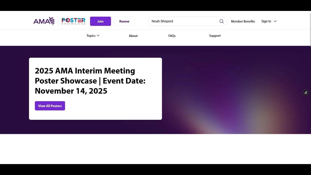
The Medical Student Outreach team requested a digital product the medical student outreach team could use for two of their events, the poster showcase and the larger research challenge.
Audience
Medical Students, Medical Residents and Physician Judges
Team
Other UX designers: J. Pencak, A.O’Flinn; Product Manager: D. Mouserak; Developers: C. Harder, J. Thorne, A. Martinez, K. Graves, A. Volkman; Project Manager: A. Tamalonis, Stakeholders: P. Wells, A. Moorhead, K. Tinney, Content: M. Donahue and team
My role
Visual & UX Designer II
Duration
6 months
Scope
Visual Design, UX Design
The Background
The AMA hosts two events annually, the research challenge & poster symposium, and the poster showcase. During these events, medical students compete for a cash prize. The medical student outreach team requested our team find a way to replace the platform they were using Underline.io. The events have a substantial impact on AMA membership. They provide medical students and residents with a way to stand out from the competition when they begin their job search.
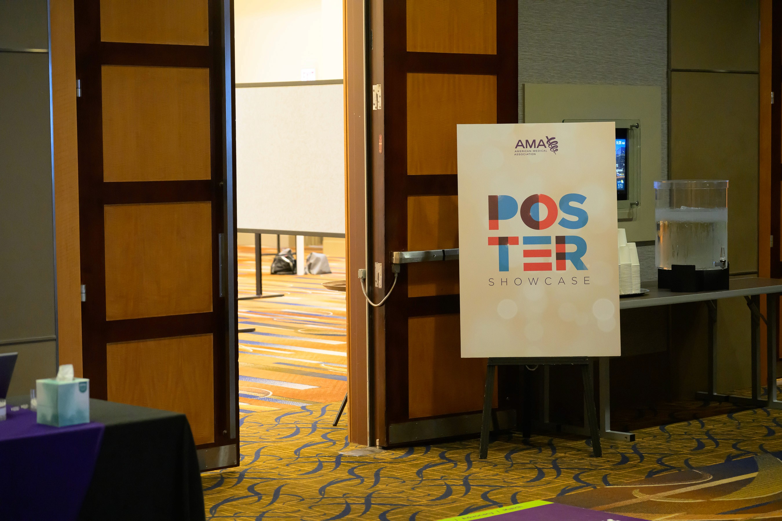
In‑person poster showcase event the digital product interacts with.
The Challenge
After speaking with stakeholders, my team understood that the main problem users were facing was misinterpreting the contest rules. The layout of the design made the abstract seem more important than the poster.
During this project, we encountered several constraints. Due to sprint timing and technical feasibility, some of what the developers built didn’t match the designs exactly, particularly with the commenting component. Additionally, leadership wanted to work with as many current components as possible. Therefore, our team was limited on the number of new components we could design.
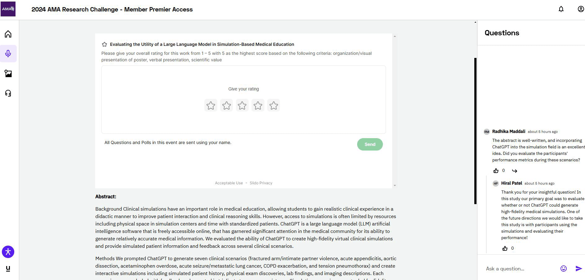
Underline.io platform the student outreach team was using before our redesign.
The Opportunity
Early on, we planned for scalability, since we had received requests from other business units for micro-sites that could promote content from their specific domains. The Acquia platform, which previously hosted our microsites, was limited in what it could handle and didn’t align with our design system. A key part of the project became moving that experience to our enterprise website’s architecture.
Some other issues we experienced with the Acquia platform were that it had dated designs, the front-end experience was difficult to use, and the back-end experience forced our content editors to understand two different systems. Thus, we were unlocking value for business units within the AMA, as well as improving the experience for both front end and back end users.
Acquia-hosted Moving Medicine microsite that highlights dated design.
The Approach
We began the project exploring layouts for two different page templates. From that, we gathered what components we needed to create and which ones we could reuse.
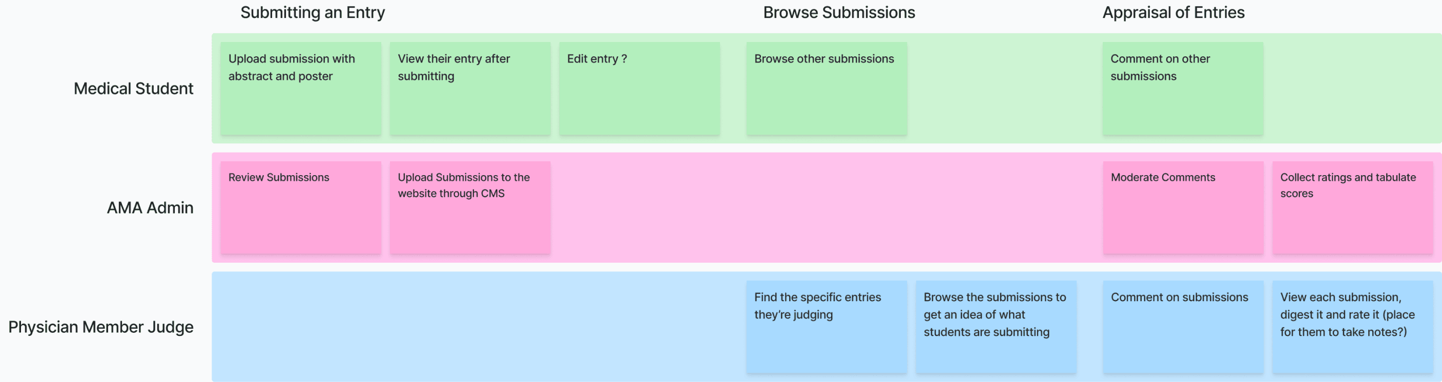
Task map outlining how different users interact with teh poster showcase event based on their role.
Page templates
First, to organize the layout of the pages, I created lo-fi wireframes using the Bloo UI kit. To design the layout, I took inspiration from the current platform, and the platform Oxford created for poster symposiums, as well as sites that focus on display of visuals, such as Dribbble and Awwwards. The final designs transformed significantly from these original layout ideas due to iteration plus stakeholder and developer alignment. This exercise really helped me anticipate the specific components needed to bring the entire vision together.
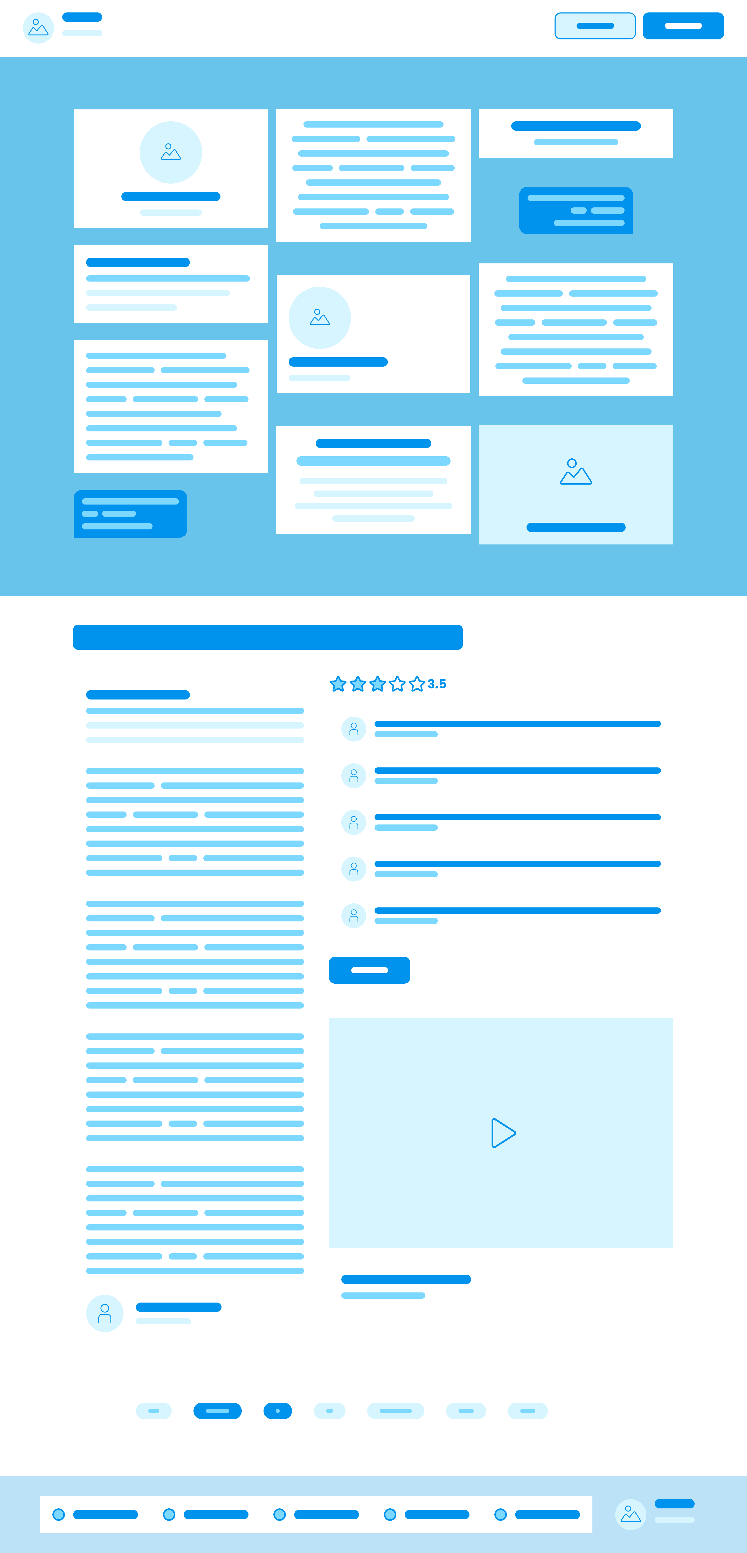
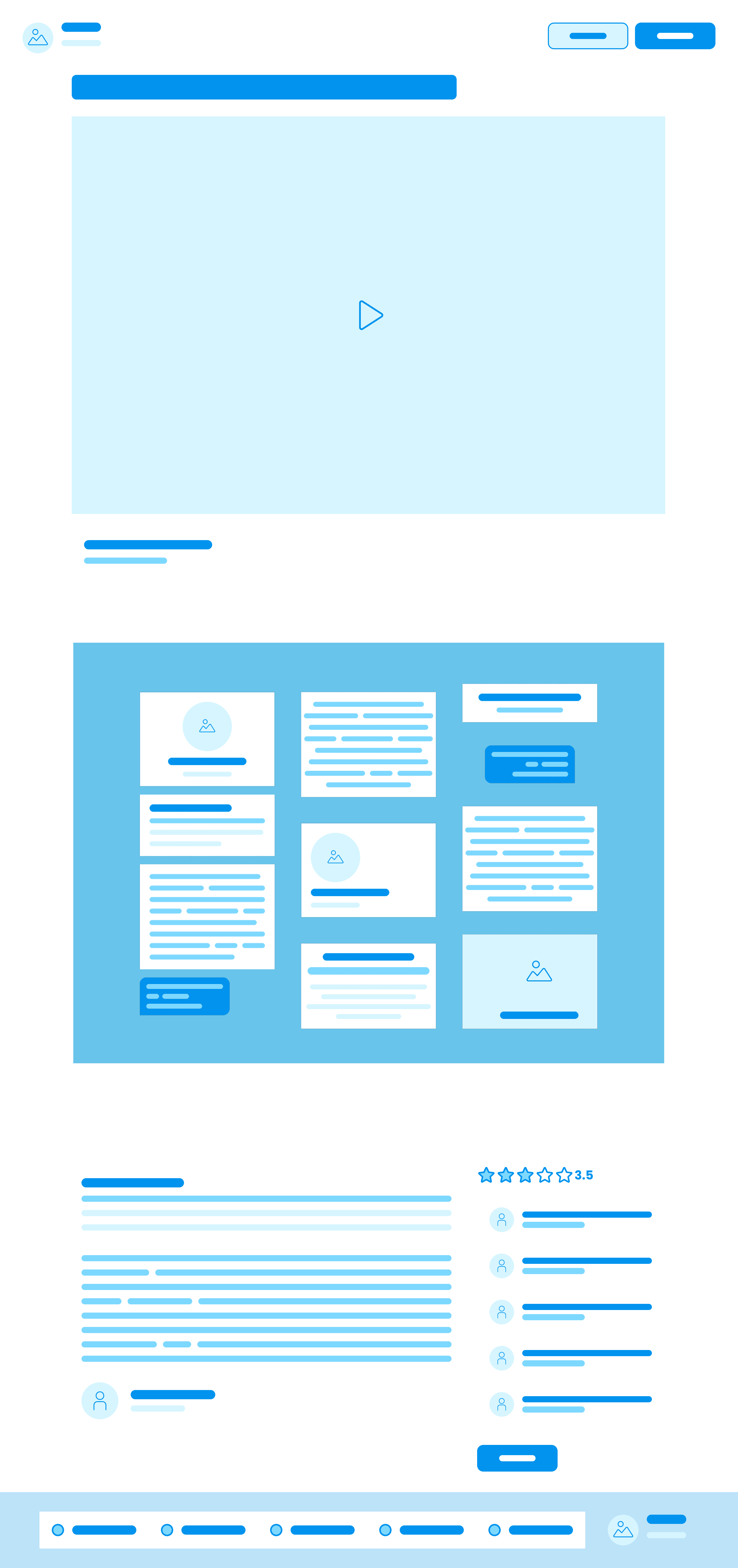
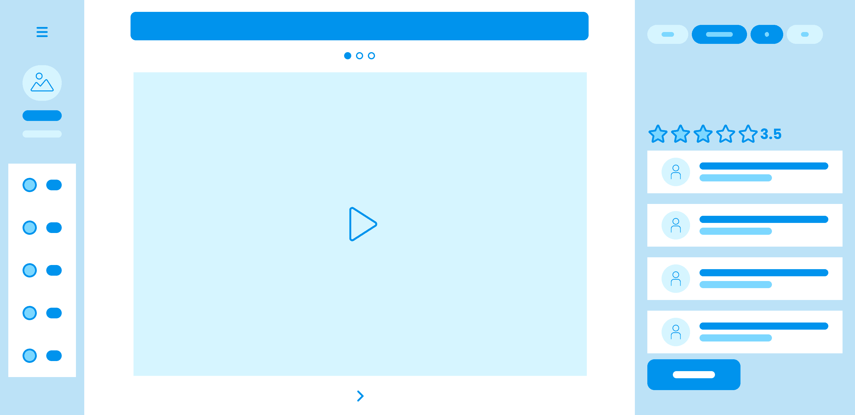
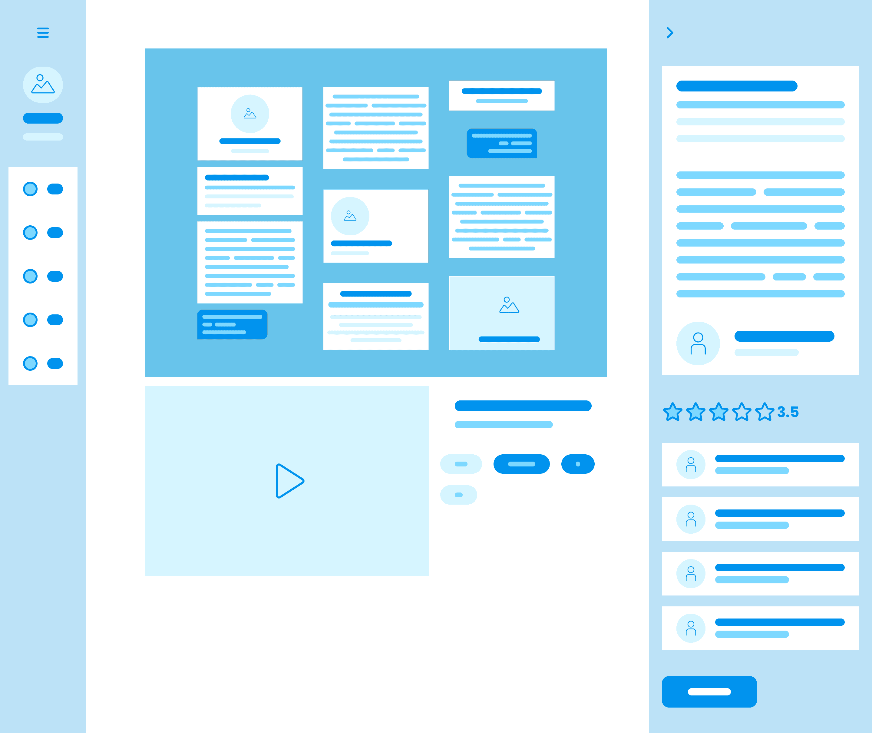

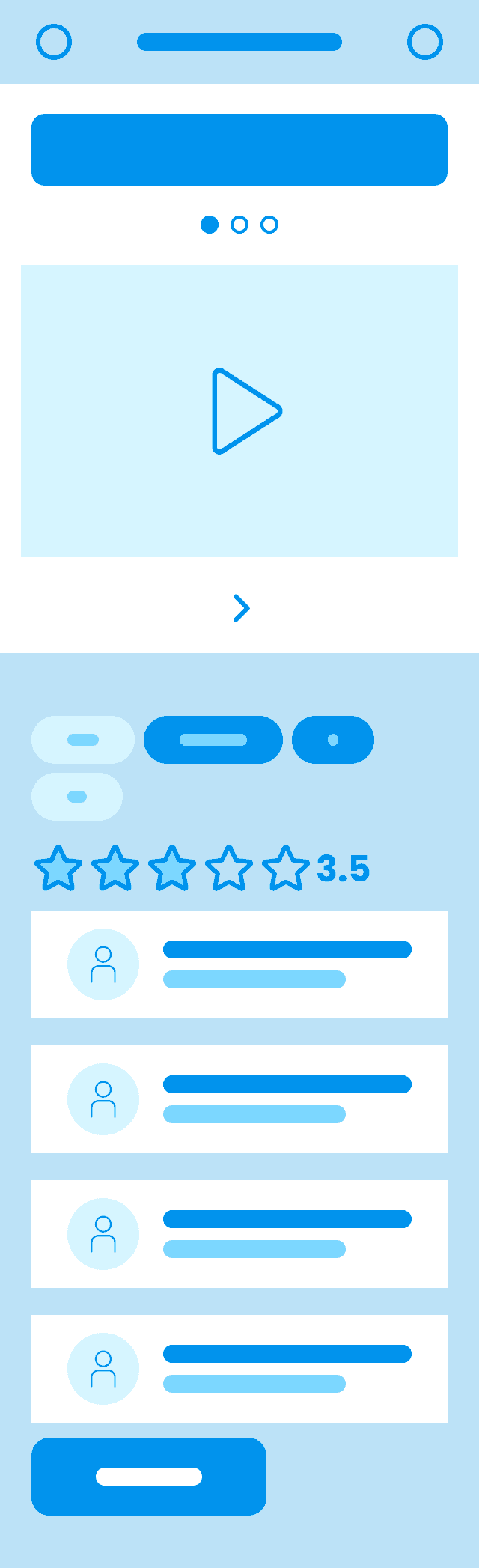

Lo‑fi page templates I created to explore overall layout before defining components and moving into hi-fi designs.
Narrowing the Field
After feedback from the other designers on my team, I brought two of the concepts into high-fidelity. I presented the stakeholders with both options, the first requiring a new template while the second used an existing template.

Two high-fidelity poster page concepts, one new template and one modified article template, with annotations comparing layout, hierarchy, and component placement.
Media and Content Containers
First I drilled down on components that housed the content students were submitting. I created the following:
The Poster Container
A container hosted by Adobe that we could embed into each of the pages. This would give the students the opportunity to upload their posters via pdf format. The embed allowed users to zoom into posters and move around the posters so they could view it closely. I reformatted the embed so it matched our design system.
The Abstract Container
A container that would hold the abstract of their research project. We decided to provide general section headings to organize the content better instead of having a full block of text.
The Video Container
The last container hosted a video on the Brightcove platform. The container allowed for student’s to record a 3 to 5 minute video presentation on their work. This part was not required to participate in the contest, so we also had to account for what would happen if this element was missing.

Media and content reusable components for posters, abstracts, and optional videos that we added to our design system.
Supporting Components
To support the media containers, we designed a ratings module, a commenting module, a jump navigation, the search bar and the search results pattern. When we were finished with those components, we moved on to the connecting pieces, like the navigation experience. And the senior designer on my team, Allison, worked on the landing page.
Detailed states for the scoring component for members and non-members
The Outcome
We created a digital product that met the needs of the student outreach team, but is also scalable to meet other teams needs. For instance, our board is now working with our team to create a place to host leadership opportunities with the AMA.
Prototype walkthrough of a judge reviewing and scoring a poster in the new experience with a spelling error during the search process.
The Scale
What started as a poster showcase platform became a reusable collections template adopted across the organization for completely different purposes. This demonstrates how a well-structured website can scale to support multiple business units and use cases. In the next section tweaks made for each project are highlights as well as ownership.
Research Challenge
Adapted the poster showcase into a research submission platform with 500+ posters across 30 subtopics. For this version, I moved the filters from the dropdown into a left-hand column. There were too many options for the dropdown to make sense, and we wanted to add more hierarchy. I designed the tabs component, breadcrumb, and card stacking pattern, and fixed a type hierarchy bug in the accordion.

Mockup of the search page of the Research Challenge collections site displaying the new filters
For mobile, we made some key updates to the template. The filters moved out of the dropdown into a dedicated drawer. There were too many filter options for the dropdown to make sense, and we wanted to add more hierarchy to the filtering experience. On the detail page, I proposed making the jump-to-section nav sticky at the bottom of the screen so users could move between sections without scrolling all the way back up. The menu existed on both desktop and mobile before, it just wasn't sticky. The stickiness got approved, but having it as a fixed element on mobile didn't make the cut. The landing page was built entirely from components we already had, so no new work there.

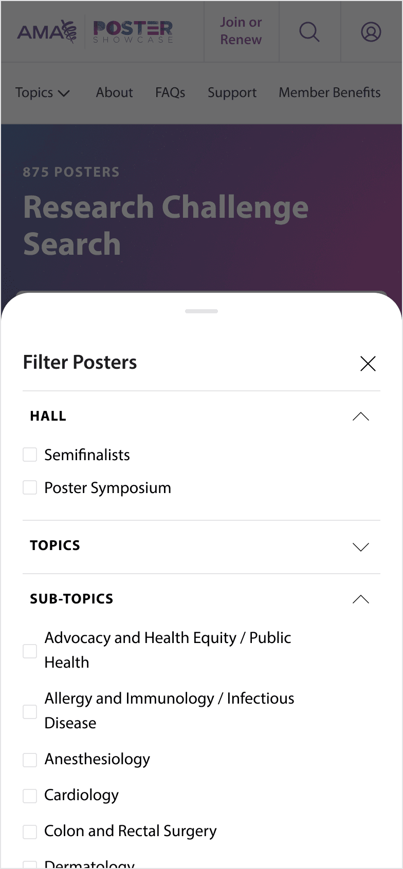

Mobile designs of the landing page, filter drawer, and detail page with sticky jump-to-section navigation.
Vaccine Resources
A clinical resource hub for physicians with conversation guides, scoring tools, billing guides, and CME training materials. I created the tabs component, breadcrumb, and helped with the card stacking designs. I also fixed a type hierarchy bug in the accordion with my designs. Allison, the other designer on the team, handled the rest. She fixed the featured block and created the downloadable file link rows in the accordion.

Mockup of the vaccine resources page
Poster Showcase (Years 2 & 3)
For the second poster showcase, we mostly focused on fixing bugs that came up during UAT. We worked through Anthony's bug board to clean things up before launch.

Live production screenshot of the 2026 Annual Poster Showcase search page.
Leadership Opportunities Board
A board for AMA members to discover and apply for leadership positions across sections and committees. Allison owned the design tweaks for this one. She adapted the collections template's filtering and detail-page patterns for position listings.

Mockup of the Leadership Opportunities Board
The Impact
Metrics
From an event with about 800 participants, we converted 2 people to member status. That may seem small, but in order to become a member a person must have graduated with a medical degree from an accredited university and practice in the United States. There's a lot of verification and a fee that goes into joining. We had 18 registrations, which is when a user signs up for an AMA account giving them access to our digital products. There are no requirements for to register. The account exists for lead generation.
Feedback
The student outreach team provided glowing reviews of the final experience. For the second poster showcase, they sent out a marketing survey, We found during UAT and smoke testing about 20 bugs or enhancements we need to make before next launch. Our team will also assist the developers in implementing those fixes.
Next Time
If I had to do this project again, I would reach out to our marketing research team in order to conduct user testing of the new experience before launching instead of waiting until UAT to find issues. I would also focus on improving communication between our team and the development team so we could reduce last-minute compromises made.
Heat Maps
During UAT for the second poster showcase, we ran Quantum Metrics across the key pages. The heat maps confirmed that users were engaging with the features we prioritized. Topic browsing, search filters, poster cards, and the jump-to-section navigation on detail pages all lit up. The video embeds and comments sections got less attention, which lined up with what we expected for a research-focused audience.
At a glance
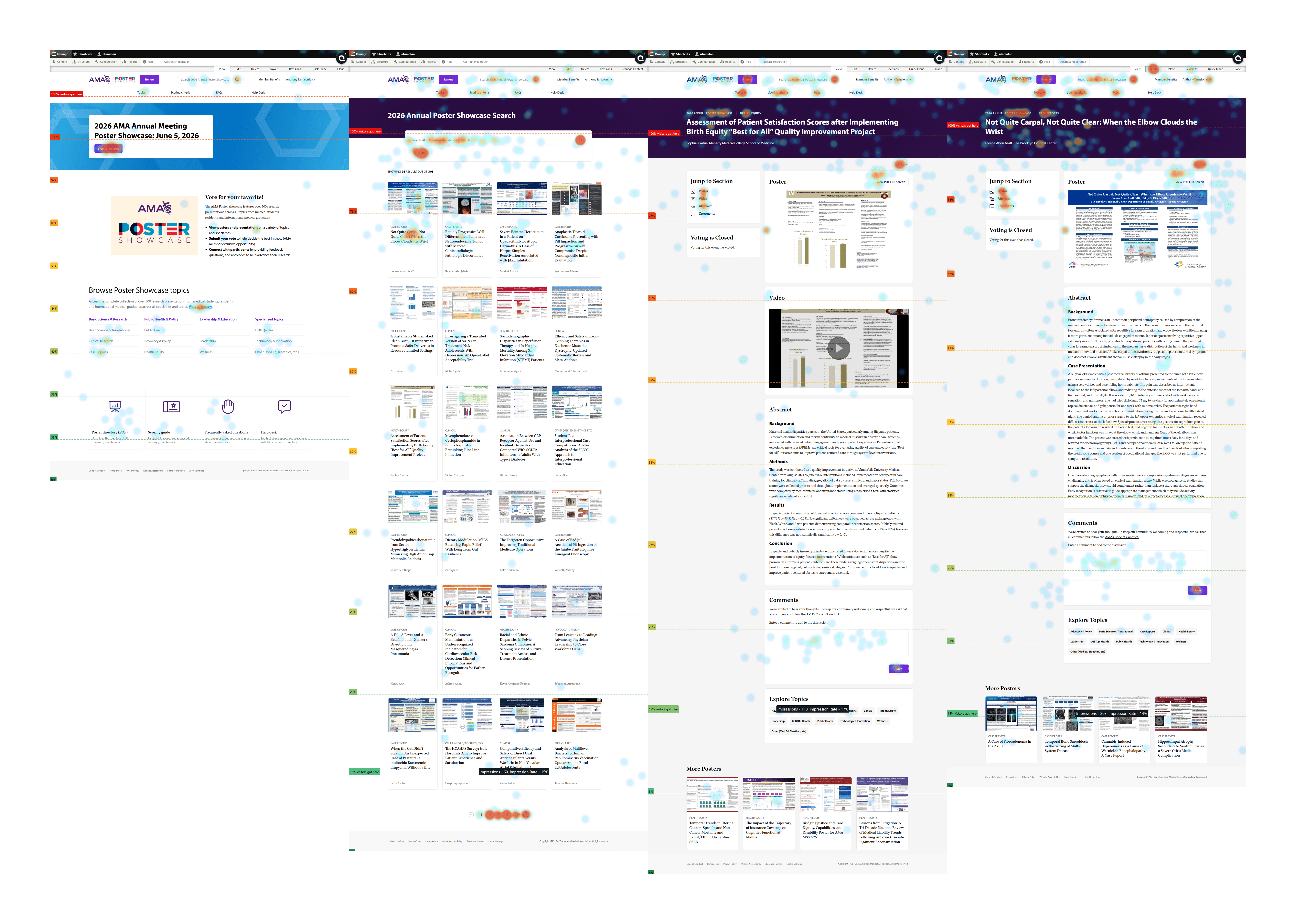


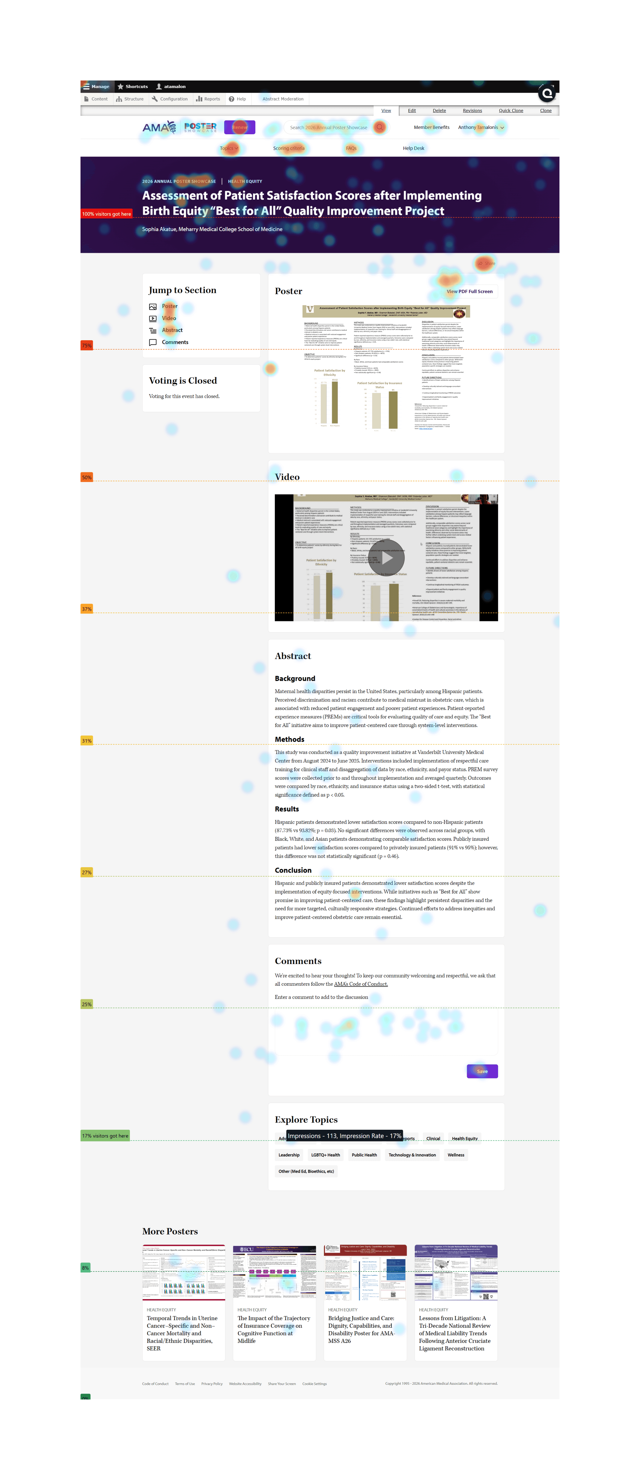

Quantum Metrics heat maps from the 2026 Research Challenge UAT showing user engagement across landing, search, and detail pages.