
A screenshot of the footer on the live site taken on 2026.07.23.
The American Medical Association
Unifying the AMA Footer Experience Across Digital Products
The AMA's footer was outdated, inconsistent across products, and couldn't scale to meet the demands of multiple business units all competing for link space. By collaborating with many stakeholders, I was able to redesign it as a flexible component system, which now lives across AMA Enterprise, FREIDA, GCEP, AMC and UCEP, with 93% footer engagement and 4.2% social interaction.
Audience
Physicians, Residents and Medical Students
Team
Product Manager: S. Raza; Developers: J. Thorne, C. Harder, K. Graves
Scope
Visual Design, UX Design, Component Design
Role
Lead Product Designer
Duration
One 3-week sprint
Background
Over the past five years, the AMA has been working to unify the branding of all its business units under one cohesive brand, AMA One, which is also how we refer to the enterprise site. However, there are use cases where individual business units like FREIDA, GCEP, and UCEP need their own digital products. We still want those products to feel like they belong under the AMA brand, so the footer became a natural opportunity to reinforce that unity. It's the one component that appears on every page across every product. On top of that, updating the footer had been a topic of conversation since I started. It was long overdue for a redesign that could scale with the organization's evolving digital presence.

The original AMA footer before the redesign
The Challenge
The AMA's footer had to serve a wide range of stakeholders. Multiple business units and product teams all wanted their links represented. Each group advocated for their own content, and the old footer couldn't scale to accommodate them all. The real challenge was designing a system flexible enough to let content editors add as many links as they need with no hard cap on the number of links per category, while also gracefully handling very long link titles like "AMA UME Curricular Enrichment Program" and "AMA GME Competency Education Program" without breaking the layout. The footer had to be a living, editor-driven component, not a static design that would need a redesign and a developer ticket every time a new link was added.

The old mobile footer experience.
The Exploration
I explored five distinct footer concepts. Every concept was mocked up for both AMA One and FREIDA to test cross-brand flexibility. I annotated each one, evaluating how it handled link organization through semantic headers and columns, where to place the newsletter promo (separated from the footer for a clearer CTA and a more compact footer), how to treat social icons and legal links, and whether accordions could improve scannability on mobile. The concepts with the strongest rationale forward into the final design.

Early design explorations for the AMA Enterprise variant.
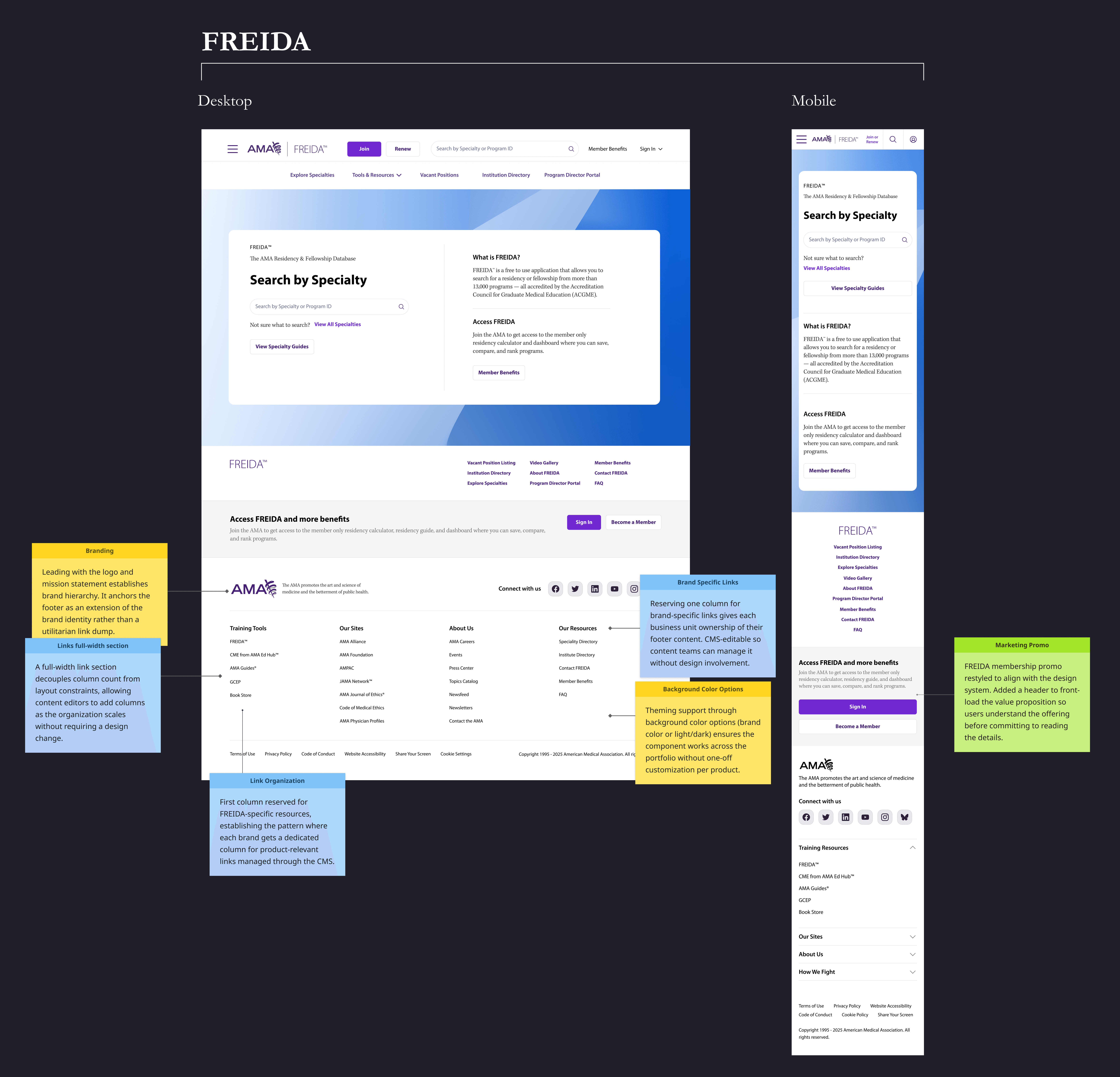
Early design explorations for the FREIDA variant.
The Approach
After stakeholder review, I developed a configurable multi-column footer with descriptive headers and a dedicated subscription section above it. I designed responsive desktop, tablet, and mobile views, using accordions on mobile to keep long navigation lists scannable.

Semantic Headers
The old footer listed links without any grouping, forcing users to scan every item. The redesigned footer organizes links under descriptive column headers using semantic HTML tags that were not a part of the taxonomy. This provides users with category-level information scent while providing proper structure for screen reader navigation and adding to SEO discoverability. The headers are CMS-managed so the content editors can group them based on what makes sense for the business units.
Four Column Layout
The old footer spread links across two columns and three rows with no clear hierarchy, forcing users' eyes to dart around to find what they needed. By using a maximum of four columns that accommodate unlimited links, with a suggested max of eight per column, users will have an easier time scanning the links sequentially in a single direction. We accounted for long link titles as well by making sure the links wrap properly to the next line in each column.
Dedicated Subscription Section
In the old footer, the newsletter signup competed with navigation links for attention, adding to the cognitive load. Moving the subscription signup out of the footer and into its own dedicated section reduces that noise. This separation lets the primary CTA stand out, giving users a clear path to action without being overwhelmed by surrounding navigation content. In our design system, this section and the footer are paired as a standard global pattern, except when the slim footer variation is used.
Mobile Accordion
On mobile, displaying every link at once creates a massive wall of text. We used accordions to hide the clutter, intentionally leaving just the first section open as a preview so users know they can expand the rest. This lets them scan the headers quickly and only open what they actually need.
The Slim Footer
Not every page needed a full navigation footer. For landing pages, the Account Management Center, and the Collections microsite, a full footer would overwhelm the user and distract from the primary content. To solve for this, I designed a slim footer variant that retains essential links like legal and social in a compact format. It supports up to three rows of links when needed. The structure leaves room to accommodate a justified product requirement, but the default recommendation is to keep the slim footer intentionally limited so it does not compete with the page’s primary content.

Drafts of the slim footer I presented to leadership, with the screen I recommended highlighted in a different color label.

Suggested CMS Form for the Drupal interface

Screenshot of the footer live used by the AMC taken on 2026.07.24
Handoff & Iteration
I worked closely with developers through the build process, providing annotated specs and component documentation. During the initial implementation, we encountered a roadblock where the spacing variables rendered much larger in code than intended in the design files. The resulting layout felt too oversized for production, which drew critical pushback from our director who wanted a tighter visual footprint before going live.
To resolve this quickly, I hopped on sync calls and pairing sessions with the engineering team to audit the CSS layout values together. I provided targeted feedback showing exactly where the code variables needed alignment with the design system tokens. By jumping into these collaborative technical meetings, we managed to refine the front-end layout across several rapid UAT cycles, ultimately delivering a compact and polished final product that satisfied leadership.

Several of the deliverables handed off to developers.
The Impact
Since launching the redesigned footer across AMA properties, we tracked user engagement through heatmaps and analytics to evaluate the new layout. Even though only 4 percent of visitors scroll all the way to the bottom of the page, we achieved a 93% footer engagement rate among those who reached it. The data shows strong engagement with the main navigation categories, which captured 88% of all footer clicks, while the social media links brought in a steady 4.2% click-through rate. These numbers prove the new layout successfully provides a clear information scent, creating a highly functional and consistent experience across AMA Enterprise, FREIDA, and the rest of our digital products.

Footer links heatmap highlights
93%
Footer pattern Interaction Rate
88%
Footer Links Interaction Rate
4.2%
Social icon Click-through
Reflection
This project proved that even a standard utility like a footer requires extensive collaboration when balancing the needs of design, engineering, and corporate leadership. Navigating the diverse requests from multiple business units pushed me to design for ultimate scalability, resulting in a flexible system that serves the entire enterprise.
A footer seems straightforward until it has to work across multiple AMA digital products, accommodate competing content requests, and still feel useful to visitors. The work was as much about setting clear constraints as it was about designing the interface: what belongs in the full footer, what belongs in the slim version, and how much flexibility the system should allow without becoming cluttered.
The implementation also needed attention beyond the design files. When the first build felt too large in production, I worked with engineering through several UAT rounds to refine the spacing and bring the component back to the intended scale. The result is a shared footer system that gives teams room to adapt their content without requiring a new design or build every time.